


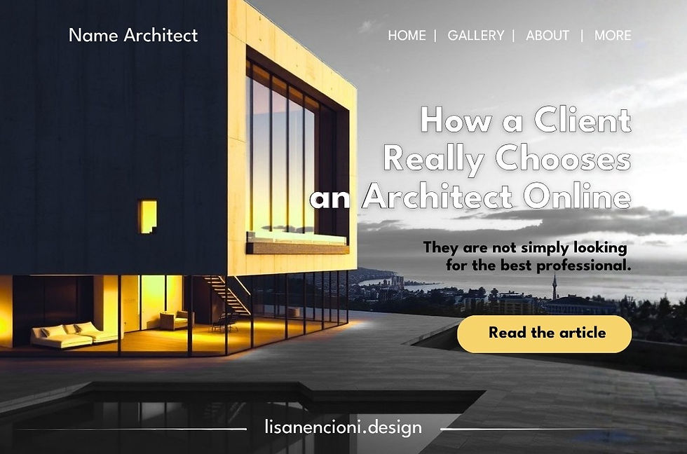
How a Client Really Chooses an Architect Online
They are not simply looking for the best professional.
They are looking for the online architect who, before they even meet them, feels right for their project.
They are not looking for just anyone
When a potential client searches for an architect online, we often imagine their journey as a rational one.
They look at several websites. Compare portfolios. Evaluate projects. Check services. Then choose the studio they consider the best.
In reality, the decision begins much earlier.
Before even reading about a project, the visitor forms an impression.
Is this studio right for me?
It is a simple question, but it already contains many others:
Can I trust them?
Do they have experience with the type of project I am looking for?
Will they understand my needs?
Is their way of working compatible with mine?
Will they pay attention to detail?
Can I afford them?
Will I feel listened to?
Are they really the person I am looking for?
A website does not necessarily answer these questions one by one.
But it communicates something nonetheless.
And that something can determine whether the visitor continues exploring the website or moves on to the next studio.
The client does not enter your website to study your CV
There is an important difference between what an architect wants to show and what a potential client wants to understand.
The architect thinks: “I need to show how good I am.”
The client thinks: “I want to understand whether you are the right person for me.”
These are two completely different perspectives.
A portfolio can contain beautiful photographs, complex projects, publications, awards and years of experience.
All of this has value.
But value is not automatically perceived.
Because the visitor is not simply looking at what you have done.
They are trying to understand what working with you might actually mean.
This is where web design stops being purely a matter of aesthetics and becomes a matter of perception.
The decision begins with perception, not evaluation
Imagine walking into two architecture studios.
In the first, you find an orderly environment, carefully chosen materials, considered lighting and only a few elements, each selected with intention.
In the second, you find dozens of samples, photographs, drawings and objects accumulated everywhere.
You still do not know which architect is more competent.
But you have already formed a first impression.
A website works in much the same way.
The homepage is the entrance to the studio.
Before discovering everything inside, the visitor perceives order, confusion, attention, superficiality, personality, distance or warmth.
It is not yet a final decision.
It is the first filter.
And just as in physical architecture, an entrance does not need to tell the story of the entire building.
It needs to help the visitor understand where they are and why it is worth stepping inside.
But does that mean the client chooses “by instinct”?
Not exactly.
The feeling is only the beginning.
After the first impression, the visitor looks for confirmation.
If the website communicates something interesting, they will start exploring.
They will look at the projects.
Read about you.
Try to understand what you do.
Observe how you present your work.
Evaluate whether you have tackled problems similar to theirs.
And, above all, mentally compare what they see with what they are looking for.
This means that the website should guide the decision.
Not simply place information next to information.
The real comparison is not “Who is the best?”
This is perhaps the most important part.
When someone compares several architects, they rarely have all the information needed to objectively determine who is the best.
They do not know the technical level of each professional.
They have not witnessed their design processes.
They do not know how they actually manage a project.
They cannot evaluate every aspect of their expertise from the outside.
So they look for other signals.
They look for consistency.
They look for recognition.
They look for professionalism.
They look for affinity.
They look for evidence that reduces perceived risk.
In other words:
they are not necessarily looking for the best architect overall.
They are looking for the one who seems most suited to their problem.
And that is a huge difference.
Why being “good” is not enough
An architect can have an excellent portfolio and a website that does not clearly communicate why they should be chosen.
They can have extensive experience, but present it in a way that feels indistinct.
They can create sophisticated projects, but show every one of them in exactly the same way.
They can be perfectly suited to a particular type of client, but give visitors no reason to recognise themselves in that expertise.
The problem, therefore, is not necessarily the quality of the professional.
It is the legibility of that quality.
A project can be extraordinary.
But if the visitor does not understand what makes it extraordinary, that quality remains invisible.
It is a little like designing a magnificent space and then hiding the entrance.
The building exists.
But not everyone will understand how to enter it.
The client is also looking for themselves in your website
There is another element that is often underestimated: identification.
A potential client wants to be able to think:
“This studio understands the kind of project I have in mind.”
Not necessarily because they have already completed exactly the same type of project.
But because the language, images, projects and way of presenting themselves create a sense of compatibility.
A client interested in a high-end contemporary renovation might be drawn to a studio that communicates precision, research, materials, attention to detail and bespoke design.
Another client might instead be looking for simplicity, practicality and a very direct relationship.
The same architect could be perfectly competent for both.
But if the website communicates only one of these identities, it will probably attract primarily those who identify with that particular communication.
And that is not necessarily a problem.
A good website does not have to appeal to everyone.
It should make it easier for the right people to recognise that the studio could be right for them.
The website therefore becomes a selection tool
This perspective completely changes the way a website for architects should be designed.
The goal is not to get the greatest possible number of visits.
Nor is it to convince everyone to get in touch.
The goal is to create the conditions for the right visitor to reach a conclusion:
“This is the kind of professional I have been looking for.”
Every element can contribute to that process.
The homepage creates the first point of orientation.
The portfolio provides evidence through the projects.
The project pages explain how you think and how you approach problems.
The About page makes the professional more human.
The services clarify what you can offer.
The process reduces uncertainty.
The call to action indicates what the next step should be.
They are not separate rooms.
They are parts of the same journey.
From visit to decision
An effective website should not ask the visitor to do all the interpretive work themselves.
It should guide them progressively.
First: “Who are you?”
Then: “Why should I consider you?”
Then: “Do you understand the kind of project I have?”
Then: “Do I like the way you work?”
And finally: “Do I feel confident enough to contact you?”
Conversion, therefore, does not magically happen when the “Contact” button appears.
It is the result of a series of previous micro-decisions.
Every section can increase or decrease trust.
Every image can clarify or confuse.
Every design choice can strengthen or weaken positioning.
The point of contact comes at the end of a journey that began much earlier.
The question is not “Is my website beautiful?”
It is a legitimate question. But it is not the most useful one.
Instead, ask yourself:
“After visiting my website, does a potential client understand why I could be the right architect for them?”
And also: “What signals allow them to understand that?”
If the answer is simply “because I have beautiful projects,” perhaps the website is showing your work, but it is not yet guiding the decision.
Because a portfolio can demonstrate that you know how to design.
A strategically designed website should do something more:
make it clear who you are right for, why they should choose you, and what they can expect from working with you.
The difference may seem subtle.
In reality, it completely changes the design.
A website should not simply showcase a building.
It should design the journey through which a visitor decides whether they want to step inside.